After Seeing These 15 Maps You’ll Never Look At The World The Same
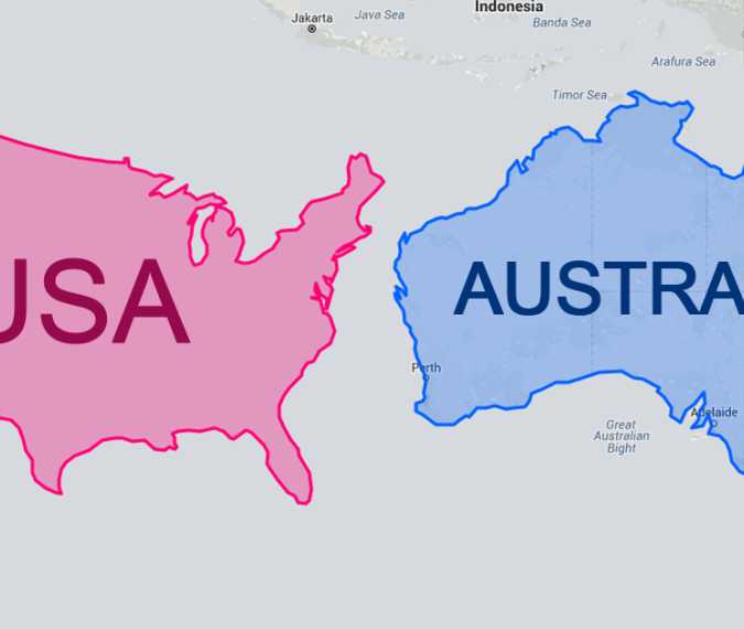
The misperception of the sizes of countries on maps is a common phenomenon that can be attributed to the Mercator Projection. The task of transforming a three-dimensional planet onto a two-dimensional plane posed a considerable challenge for early cartographers, which prompted Flemish geographer and cartographer Gerardus Mercator to devise a solution. In 1569, Mercator created a map that was accurately usable for navigation, but the downside was that his system resulted in distorted sizes of objects based on their positions relative to the equator. This distortion causes landmasses, such as Greenland and Antarctica, to appear much larger than they actually are.
To illustrate the flawed nature of our understanding of country sizes, a website named thetruesize.com allows you to move landmasses to different locations. Bored Panda conducted an experiment on this website, which resulted in some intriguing findings.


