Terrifying map identifies US states possibly targeted in nuclear attack if WW3 breaks out
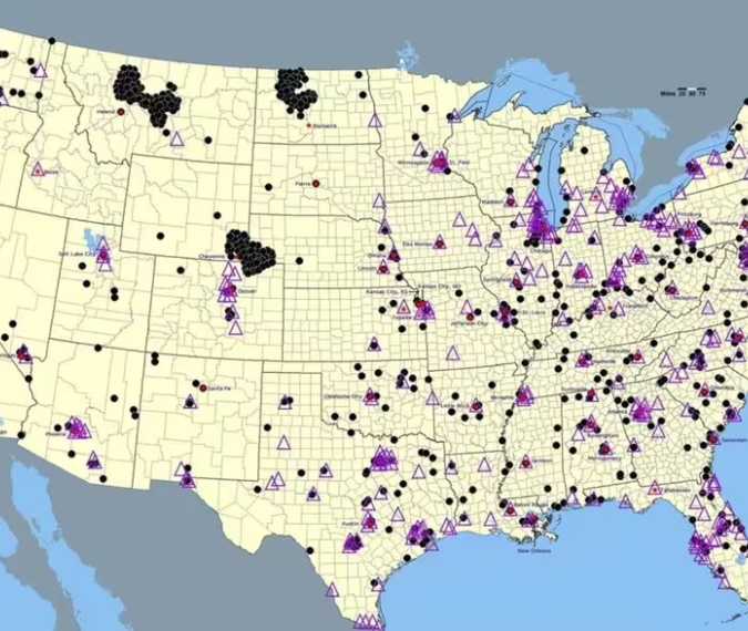
Maps marking possible nuclear targets across the United States can look like forecasts of an approaching disaster. But the widely circulated map discussed in recent coverage has a much older history—and cannot establish where a future attack would occur.
CBS published the map in March 2015, long before the current conflict with Iran. Its appearance in new reporting should not be mistaken for a newly issued threat assessment.
According to a Snopes investigation, the map originated in a 2002 study of hypothetical Russian nuclear attacks, rather than a recent FEMA warning.
That distinction matters when interpreting its connection to events in the Middle East. U.S. Central Command has confirmed Operation Epic Fury against Iranian targets. However, that operation does not turn an older hypothetical scenario involving Russia into evidence of an impending nuclear strike on America.
Some of the states featured prominently in discussions of nuclear risk have an identifiable military significance. The U.S. Air Force says its Minuteman III missile fields extend across Montana, North Dakota, Wyoming, Nebraska and Colorado. Their role in America’s nuclear deterrent explains why these regions feature in strategic discussions, but does not establish the probability of an attack.
Civilian nuclear facilities also require more careful treatment than the original coverage suggests. The U.S. Energy Information Administration reported 94 operating commercial reactors at 54 power plants as of March 2026. Reactors and power plants are different counts, so calling the country approximately 90 nuclear power plants is misleading.
Nor can sparsely marked areas on a target map reliably be labeled safe. The effects of a nuclear detonation depend on the weapon’s yield, the height of the explosion, local terrain and weather. Radioactive fallout can travel downwind, exposing communities beyond the immediate blast area.
For readers assessing alarming headlines, the essential questions are when a map was created, what scenario it models, and what evidence supports its claims. A historical illustration can help explain a hypothetical danger. It cannot tell Americans which communities would be attacked—or which would escape harm.
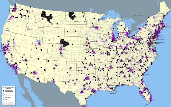
The origins of this alarming map trace back to a CBS article from 2015, citing sources such as FEMA, Medicine and Global Survival, and the National Resources Defense Council (Image: CBS News)